10,000 search results
(0.029 seconds)
- ITC Viner Hand by ITC,
$29.99ITC Viner Hand is the work of British designer John Viner, and it is based on his own handwriting. The warmth and familiarity of this informal script will lend a relaxed and personal touch to any application. - Diner - Unknown license

- Niner - Unknown license

- Venereal - Unknown license

- Vinea by Greater Albion Typefounders,
$12.00 Vinea is a family of ten display faces that take us on an enjoyable excursion into the world of the retro-futuristic. Ideal for posters, book covers, and anything that needs the sort of futuristic feel that abounded in designs from the 30s to the fifties. The en faces have been designed with uniform metrics, to facilitate multi-coloured overlay effects.
 - Kiner by Yock Mercado,
$12.00 Kiner is a typeface designed by Jorge Mercado, inspired in old western letters used in many industries. Kiner support most latin languages, and the set includes uppercase and lowercase.
 - Mineral by bb-bureau,
$60.00 Glittering writing, fractured into multiple tetragonal splinters, rectangular modules slightly spaced, like quartz and pixels. A Kapla style construction, with stencil properties (except Border and Outline version ) designed by Benoît Bodhuin . Mineral Solid has 4 stylistic titling alternatives (Border, Outline, Blunt and Smooth).
 - Vinery by RagamKata,
$16.00 Vinery Sans serif Introducing Vinery - our latest sans serif font that combines modern design with unique swash alternates. This font is perfect for any design project that requires a clean and sleek look. With its minimalist and elegant design, it's ideal for branding, packaging, editorial, or web design. Vinery comes with a range of swash alternates that are carefully crafted to add an extra level of creativity to your designs. Whether you're looking for a simple or elaborate swash, this font has got you covered. The alternates are easily accessible, so you can switch them up to create different styles within your design. This font features a modern and sophisticated look with its clean lines and geometric shapes. It's easy to read and versatile, making it suitable for both headlines and body text. Vinery is perfect for creating a contemporary and professional look that stands out. With its unique swash alternates, it's sure to add a touch of creativity to any project. Try it out today and take your designs to the next level!
 - LTC Vine Leaves by Lanston Type Co.,
$24.95
- Viper Squadron - Unknown license

- ideoma LINER - Personal use only

- BON ViVER - Unknown license

- Viney Times - Unknown license

- Viper Squadron - Unknown license

- Midnight Diner by Roland Hüse Design,
$30.00 Did your client just say ‘can you make it pop’? Then you already know you got it on lock. Introducing: Midnight Diner! A multi-layered dimensional script font family featuring thin, bold, outline and shadow capabilities, with a left-leaning slant to boot. You can experiment with various layer combinations and colour! How fun is that? Being effortlessly casual, retro and elegant all in one, you can play it up or down to your liking – perfect for display graphics, logos, signages, packaging, lifestyle imagery, invitations and more. It features a diverse range of stylistic alternates, contextual alternates, and standard ligatures, ensuring that you’ve countless options to choose from for your design work. This font family is delicately crafted and well thought out with every little detail in mind, to ensure its ease and versatility when used! Midnight Diner is a collaboration between lettering artist and calligrapher, Leah Chong (www.leahdesign.sg) and typeface designer, Roland Huse (www.rolandhuse.com). Product Content: Midnight Diner Layered Font - Thin (TTF) Midnight Diner Layered Font - Bold (TTF) Midnight Diner Layered Font - Outline (TTF) Midnight Diner Layered Font - Shadow (TTF) Font Guide PDF https://drive.google.com/file/d/1KPSf-gGrhX3wyaImEAmlJICERNbxu2IN/view?usp=sharing Font Guide Youtube Video https://youtu.be/GtZ8E7Y7wnQ 6 Bonus SVGs (TTF): Midnight Diner SVG - Red Yellow Midnight Diner SVG - Black Pink Midnight Diner SVG - Blue Green Midnight Diner SVG - Orange Yellow Midnight Diner SVG - Purple Pink Midnight Diner SVG - Black White Font Features: Latin character set: Uppercase & Lowercase A - Z Stylistic Alternates Contextual Alternates Standard Ligatures Numerals, Currency Symbols & Punctuation Accented Characters To access all features of Midnight Diner such as stylistic alternates etc., it's highly recommended to use professional design software such as Adobe Illustrator, Adobe Photoshop, Adobe InDesign or Procreate (via the ‘add text' feature).
 - Club Winers by Andfonts,
$29.00 Elevate your designs with Club Winers, a captivating serif font that exudes sophistication, richness, and luxury. With its elegant and timeless appeal, Club Winers is the perfect choice for those seeking a touch of refined beauty in their typographic creations. Designed with meticulous attention to detail, Club Winers showcases graceful serifs, meticulously crafted letterforms, and subtle yet distinctive curves. Each character is thoughtfully balanced, resulting in a harmonious interplay between classic elegance and contemporary allure. All CAPS letters have alternates.
 - Sixty Niners by Putracetol,
$24.00 Introducing Sixty Niners - a retro display font that draws inspiration from unique typography and lettering found in vintage magazines, combined with modern typography styles. This font features modern ligatures that allow you to create beautiful lettering and artwork. With its open type features, including a variety of alternates and end swashes, Sixty Niners provides ample options for customization and creativity. Sixty Niners is perfect for a wide range of design purposes, including logotypes, headings, covers, posters, logos, quotes, product packaging, headers, merchandise, social media posts, greeting cards, and more. Its distinctive retro style adds a touch of nostalgia and elegance to your designs, making them stand out and capture attention. To access the alternate glyphs in Sixty Niners, you can use design programs that support OpenType features, such as Adobe Illustrator CS, Adobe Photoshop CC, Adobe InDesign, and Corel Draw. This allows you to easily switch between uppercase and lowercase letters, apply alternates and ligatures, and create unique and customized lettering compositions that suit your design needs. In your zip package, you'll find the Sixty Niners font files in otf, ttf, and woff formats, providing versatility for different design projects. The font includes uppercase and lowercase letters, numerals, punctuation, and symbols, ensuring that you have all the elements you need for your designs. Sixty Niners also offers multilingual support, making it accessible for designers around the world to create designs in different languages. Whether you're designing for English, Spanish, French, or any other language, Sixty Niners has got you covered. In summary, Sixty Niners is a retro display font that combines vintage and modern typography styles, providing a unique and elegant look to your designs. With its open type features, multilingual support, and versatile design options, Sixty Niners is perfect for various design purposes. So, elevate your designs with Sixty Niners and create stunning artwork that captures attention and stands out from the crowd! Thank you for choosing Sixty Niners from our collection. Happy designing!
 - Classy Diner by Haiku Monkey,
$10.00Handwritten with care, and made bold and consistent with an art deco flair. If I owned a classy diner, this is how I'd like my chalkboard menus to look. - Einer Grotesk by Designova,
$15.00 Einer Grotesk is a timeless sans-serif typeface family of 16 fonts, made with perfection in every aspect of design. Created with a special focus on readability and visual aesthetics, this typeface can transform your design projects to another level of craftsmanship. Handcrafted and designed with powerful OpenType features in mind, each weight includes extended language support, including Western European & Central European sets. A total of 294 glyphs are included. Einer Grotesk is a perfect choice for graphic design, text presentation, web design, print, and display use. The typeface can be an amazing option for beautiful branding, logo/logotype design projects, marketing graphics, banners, posters, signage, corporate identities as well as editorial design. Adding extra letter-spacing for the Caps will make this font perfect for minimal headlines and logotypes as shown in promo images here.
 - Koscar Liners by madeDeduk,
$14.00 Introducing Koscar Liners is a realistic handwritten font and will be perfect for book, title branding, product packaging, invitation, quotes, label, poster, logo etc. Feature Uppercase & Lowercase Number & Symbol International Glyphs Multilingual support Alternative Ligature Thanks so much for checking out my shop and feel free to drop us a message any time and follow my shop for upcoming updates Hope you enjoy it.
 - Perfecta Liner by Invasi Studio,
$17.00 Perfecta Liner is a handwritten organic font that is perfect for branding, signatures, wedding invitations, promotions, product packaging, and more. Perfecta Liner is a modern, clean, authentic font. Perfecta Liner comes with ligatures, alternates, and supports 60+ Latin-based languages. Features: Total 261 Glyph Uppercase & Lowercase Numerals & Punctuation Alternates and Ligatures Multilanguage Supports 60+ Latin based languages
 - Liner Notes by AdultHumanMale,
$20.00 Liner Notes is a fun scrawly, marker felt, ALL CAPS display font. I wanted it to look fun, loud, and to have hints of School graffiti, so it can wail from Posters and Headlines. It has over 260 glyphs and several variations on the standard alphabet and all those extra pésk¥ foreign features. It also has various letters with extra ligatures and flourishes available through OpenType or your Glyphs palette. OMG, LOL I also added some web slang to the glyphs.
 - Velocity Vipers by Mevstory Studio,
$25.00 Velocity Vipers Brush Font, a modern and stylish font style influenced by urban style and branded goods that can be used in a wide variety of ways by Lettercorner Studio Velocity Vipers font is ideal for branding, photo overlays, watermark, typography, greeting cards, posters, business card, branding projects, social media posts, magazines, book covers, invitations, weddings, photography, fashion, apparel, letter, stationery, or any tasks that need a signature taste.
 - Vine Street by Proportional Lime,
$9.99 VineStreet a place somehow familiar to everyone in the English speaking world. It might be just around the corner or the next town over. This font gives that aged feel of comfort and familiarity and the authority of tradition. The example for this font was derived from a ecclesiastical history published by the Caxton Press of the Sherman & Co. of Philadelphia and was originally developed prior to 1867. This font has over 1000 defined glyphs and small caps included.
 - Olive Vine by Letterhend,
$19.00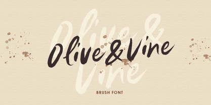 Olive & Vine is a bold hand drawn brush script which is purposely made for headline, display or logotype, and signature which need a standout appearing. This font is also suitable to be applied especially in logo, and the other various formal forms such as invitations, labels, logos, magazines, books, greeting / wedding cards, packaging, fashion, make up, stationery, novels, labels or any type of advertising purpose. Features : uppercase & lowercase numbers and punctuation multilingual alternates & ligatures PUA encoded We highly recommend using a program that supports OpenType features and Glyphs panels like many of Adobe apps and Corel Draw, so you can see and access all Glyph variations.
 - Vine Spinach by Yumna Type,
$15.00 Vine Spinach is a beautifully designed display font. The round and shadow style applied to the characters gives this font cute feel. While it's easy to read, the dramatic bold and heavy style is very suitable to be used to create titles and logos. You also get illustrations as special extra that you can use as you wish. Features: Stylistic Sets Swashes Multilingual Supports Uppercase and lowercase PUA Encoded Numerals and Punctuation This font would looks great on your branding, logos, social media quotes, stickers, posters, wall art, merchandise, social media, and many more. Get more inspiration about how to use it by seeing the font preview. Thank you for purchasing our fonts. If you have any further questions, don't hesitate to contact us. Happy Designing.
 - Vier Module by Volcano Type,
$19.00 - Viper Squadron Solid - Unknown license

- Viper Squadron Solid - Unknown license

- MFC Viper Monogram by Monogram Fonts Co.,
$19.95 The inspiration source for Viper Monogram is the 1934 Book of American Types by American Type Founders. Found in that specimen book, was a sophisticated two-color monogram design called Hollywood Combination Initials, which was available in limited size metal castings. This wonderful monogram style is now digitally recreated, revived, and updated for modern use! Viper Monogram supports one and two letter monograms, but due to its super condensed style works best for three letter monograms. The default typing style for Viper Monogram is an all horizontal all caps setup which can be used for headlines and titling. Type in Capitals for an outline effect, lowercase for a solid effect. By enabling OpenType Contextual Alternates, you can type diagonal top-aligned monograms up to three letters. By typing in all lowercase, and layer a copy of the lowercase with Stylistic Alternates enabled, you can create a two-color effect. Viper Monogram is available in Pro format Opentype fonts only due its unique setup. Download and view the MFC Viper Monogram Guidebook if you would like to learn a little more.
 - Roadside Diner JNL by Jeff Levine,
$29.00 The hand painted signage from a 1950s era photo of the Miami Diner Restaurant in Miami, Florida inspired the digital version of its 1940s-influenced lettering. Roadside Diner JNL is available in both regular and oblique versions.
 - HF American Diner by Monotype,
$29.00 - ITC Eras by ITC,
$40.99 ITC Eras font is the work of French designers Albert Boton and Albert Hollenstein. It is a typical sans serif typeface distinguished by its unusual slight forward slant and subtle variations in stroke weight. ITC Eras is an open and airy typeface inspired by both Greek stone-cut lapidary letters as well as Roman capitals.
 - ITC Cerigo by ITC,
$29.99ITC Cerigo is the result of a challenge which designer Jean-Renaud Cuaz set for himself: to create a typeface with the grace of Renaissance calligraphy but different from the numerous Chancery scripts. He calls Cerigo a 'vertical italic' and based it on 15th century calligraphic forms. The weights are carefully designed to complement each other and are made more flexible by a number of italic swash capitals. The flexible ITC Cerigo is suitable for both text and display. - ITC Photoplay by ITC,
$29.99ITC Photoplay is another gem from Nick Curtis. Unearthed from the 1927 edition of Samuel Welo's Studio Handbook for Artists and Advertisers, the design's original suggested use was for title and caption cards for silent movies. A monoweight design that bridges the gap between turn-of-the-century decorative type and Art Deco, ITC Photoplay is both casual and stylish. And, yes, the cap S" is supposed to look that that. To expand this already handy typeface's versatility, a Black weight has been added to the original design. Curtis has also created an array of alternate characters, a couple of conjunctions, and a handful of "bishop's fingers" to help make your point. ITC Photoplay is eminently suitable for all those occasions when you need to say, "Unhand that fair damsel, you dastardly cad!", and really mean it." - ITC Gargoonies by ITC,
$29.99 - ITC Johnston by ITC,
$29.00ITC Johnston is the result of the combined talents of Dave Farey and Richard Dawson, based on the work of Edward Johnston. In developing ITC Johnston, says London type designer Dave Farey, he did “lots of research on not only the face but the man.” Edward Johnston was something of an eccentric, “famous for sitting in a deck chair and carrying toast in his pockets.” (The deck chair was his preferred furniture in his own living room; the toast was so that he’d always have sustenance near at hand.) Johnston was also almost single-handedly responsible, early in this century, for the revival in Britain of the Renaissance calligraphic tradition of the chancery italic. His book Writing & Illuminating, & Lettering (with its peculiar extraneous comma in the title) is a classic on its subject, and his influence on his contemporaries was tremendous. He is perhaps best remembered, however, for the alphabet that he designed in 1916 for the London Underground Railway (now London Transport), which was based on his original “block letter” model. Johnston’s letters were constructed very carefully, based on his study of historical writing techniques at the British Museum. His capital letters took their form from the best classical Roman inscriptions. “He had serious rules for his sans serif style,” says Farey, “particularly the height-to-weight ratio of 1:7 for the construction of line weight, and therefore horizontals and verticals were to be the same thickness. Johnston’s O’s and C’s and G’s and even his S’s were constructions of perfect circles. This was a bit of a problem as far as text sizes were concerned, or in reality sizes smaller than half an inch. It also precluded any other weight but medium ‘ any weight lighter or heavier than his 1:7 relationship.” Johnston was famously slow at any project he undertook, says Farey. “He did eventually, under protest, create a bolder weight, in capitals only ‘ which took twenty years to complete.” Farey and his colleague Richard Dawson have based ITC Johnston on Edward Johnston’s original block letters, expanding them into a three-weight type family. Johnston himself never called his Underground lettering a typeface, according to Farey. It was an alphabet meant for signage and other display purposes, designed to be legible at a glance rather than readable in passages of text. Farey and Dawson’s adaptation retains the sparkling starkness of Johnston’s letters while combining comfortably into text. Johnston’s block letter bears an obvious resemblance to Gill Sans, the highly successful type family developed by Monotype in the 1920s. The young Eric Gill had studied under Johnston at the London College of Printing, worked on the Underground project with him, and followed many of the same principles in developing his own sans serif typeface. The Johnston letters gave a characteristic look to London’s transport system after the First World War, but it was Gill Sans that became the emblematic letter form of British graphic design for decades. (Johnston’s sans serif continued in use in the Underground until the early ‘80s, when a revised and modernized version, with a tighter fit and a larger x-height, was designed by the London design firm Banks and Miles.) Farey and Dawson, working from their studio in London’s Clerkenwell, wanted to create a type family that was neither a museum piece nor a bastardization, and that would “provide an alternative of the same school” to the omnipresent Gill Sans. “These alphabets,” says Farey, referring to the Johnston letters, “have never been developed as contemporary styles.” He and Dawson not only devised three weights of ITC Johnston but gave it a full set of small capitals in each weight ‘ something that neither the original Johnston face nor the Gill faces have ‘ as well as old-style figures and several alternate characters. - ITC Atmosphere by ITC,
$29.00The Algerian designer Taouffik Semmad created the fonts in 1997. Taouffik Semmad grew up speaking Algerian-Arabic dialect and French, studied Russian, and is now living in Montreal. This could perhaps explain his current passion, to "find a universal writing", which he admits is a Utopian idea. Created with brush and Chinese ink, the characters of ITC Atmosphere came from Semmad's hand but only after they were fully formed in his mind's eye. - ITC Jamille by ITC,
$29.99Mark Jamra based the design for Jamille on the forms of the 18th century Modern Face fonts of Didot and Bodoni, but was also influenced by the work of artists like Adrian Frutiger, who reworked such fonts to adapt to the demands of modern technology. A very legible font, Jamille will give text a classic, elegant feel. - ITC Clearface by ITC,
$45.99 The Clearface types were originally designed by Morris Fuller Benton in 1907. Their forms expressed the Zeitgeist of the turn of the 20th century; typical and distinguishing characteristics are the forms of the a" and the "k." The ATF version did not include an accompanying Italic. In 1978, ITC's Victor Caruso was licensed by ATF to develop a new serif typeface and matching italic based on the forms of Clearface. The result was ITC Clearface, a serif typeface with marked stroke contrast and italic weights. The teardrop-formed endings of the lowercase a, c and f (also found in Caslon) define the character of the face. The type's design is also distinguished by its small -- almost slab -- serifs, a large x-height, and little stroke contrast. ITC Clearface, with its historical touch, is good for both texts and headlines, but its slightly condensed nature performs at its best when it is allowed its space.


Page 1 of 250Next page